
お問い合わせフォームなど多用するinputタグ。このinputタグをクリックした時に、オシャレに下線を表示する方法について、JavaScriptやjQueryなどは使わずにCSSのみで作成する方法を解説します。
前回、inputタグとdivタグの2つのタグを使ってオシャレなinputボタンの作成方法を紹介しました。
(参考)【簡単解説・CSS】inputタグで動く下線を作る方法その1|divタグと作る方法。(JavaScriptやjQueryは使わない方法)
今回は、inputタグ1つのみで動く下線を作成する方法についてご紹介します。WPのプラグインなどブロックで提供されていて、新しいタグを挿入することが難しい場合に活用できます。
完成例
完成例は以下。
・左から右に向かう
・右から左に向かう
・中央から両端に向かう
・フォーカスを外したときは動かない
・下から上に覆う
・左から右に覆う
・左から右に覆う(フォーカスを外したときは動かない)
・右から左に覆う
・3本の線が動く
・2色の背景が動く
ソースコード
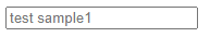
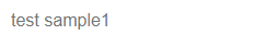
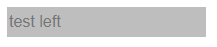
inputタグをクリックした時に、左から右に向かって下線が動くスタイルのソースコードは以下。
<input class="default-input-style dynamic-line2-left" type="text" placeholder="test left">


<style type="text/css" scoped>
    .dynamic-line2-left{
        height: 30px;
        font-size: 16px;
        border: none;
        outline: none;
        cursor: pointer;
        background-image: linear-gradient(rgb(190, 190, 190), rgb(190, 190, 190)),
    linear-gradient(rgba(255, 0, 106, 0.4), rgba(255, 0, 106, 0.4));
        background-size: 100% 2px, 100% 2px;
        background-position: 100% 100%, 0 100%;
        background-repeat: no-repeat, no-repeat;
        transition: background-size 2s ease-out;
    }

    .dynamic-line2-left:focus{
        background-size: 0 2px, 100% 2px;
    }
</style>
スタイル設定のポイントについて説明していく。
大まかなポイントとしては、複数の背景を設定して、その起点(background-position)とサイズ(background-size)に対して、動き(transition)を設定する。
以降で、コードの詳細を解説。
デフォルトのスタイルをキャンセル
inputタグのtext属性にはデフォルトで枠線のスタイルが適用されている。
選択されていない状態ではborderプロパティ、選択された状態ではoutlineプロパティが適用されているので、両方ともをキャンセルする。(※outlineのキャンセルを忘れずに)
        border: none;
        outline: none;
これで枠線が何もない状態になる。
(補足)下にdivタグで下線を作成したときは、inputタグにデフォルトで適用されているpaddingもキャンセルしたが、今回は背景を動かすため不要。
選択前のinputタグのスタイル調整
1本目のグレーの下線を作成する
上記のままだと、プレースホルダーのみの表示になるので、inputタグであることが分かり辛い。
ここに、下線を追加する。下線は、背景(background-image)の高さを2pxとして作成する。
        border: none;
        outline: none;
        background-image: linear-gradient(rgb(190, 190, 190), rgb(190, 190, 190))
background-imageで、画像ではなく色を指定する場合は、「linear-gradient」で指定する必要がある。
linear-gradient( 始点のカラー, 終点のカラー )linear-gradientはグラデーションを設定するものだが、今回は単色でいいため、始点と終点のカラーを同じ色で設定する。
この状態だと、背景が指定した色で塗りつぶされるので、「background-size」で高さを調整する。デフォルトでは背景が繰り返されてしまうので、「background-repeat: no-repeat」を指定する。
特に、「background-size」が重要。ここの設定で、下線にするのか、文字入力範囲を塗り潰すかが変わる。
background-size: x軸方向の幅 y方向の幅;ここでは、background-size: 100% 2px; を指定する。横幅いっぱいに伸びて、高さは2pxとなる。
        border: none;
        outline: none;
        background-image: linear-gradient(rgb(190, 190, 190), rgb(190, 190, 190))
        background-size: 100% 2px;
        background-repeat: no-repeat;
背景色が2pxになったが、上に表示されているので、「background-position」を使って下側に来るように指定する。
background-position: x軸方向の位置 y方向の位置;位置は、自分の初期位置を(0, 0)として、右下の端が(100%, 100%)となる。
ここでは、フォーカスをあてた時にグレーの線が、左から右に消えるようにしたい。つまり、右端の下端に起点がくるようにしたいので、(100%, 100%)を指定する。
        border: none;
        outline: none;
        background-image: linear-gradient(rgb(190, 190, 190), rgb(190, 190, 190))
        background-size: 100% 2px;
        background-repeat: no-repeat;
        background-position: 100% 100%;
2本目のピンクの下線を作成する
次に、inputタグにフォーカスしたときに表示するピンクの線を設定する。
「background-image」は、複数の画像・色を設定できる。「linear-gradient」で色を複数指定する場合は、記述する順番が重要。
先に記述したものが上にくるので、あとに記述した背景のサイズはその下に表示されるので、背景の高さや幅と位置が同じ場合は、後ろの背景は見えない。
        border: none;
        outline: none;
        background-image: linear-gradient(rgb(190, 190, 190), rgb(190, 190, 190)),
    linear-gradient(rgba(255, 0, 106, 0.4), rgba(255, 0, 106, 0.4));
        background-size: 100% 2px;
        background-repeat: no-repeat;
        background-position: 100% 100%;
「background-size」と「background-position」も設定する。
複数のbackgroundやbackground-imageを設定した時にの指定方法は、カンマで区切る。
background-size: x1軸方向の幅 y1方向の幅, x2軸方向の幅 y2方向の幅, x3軸方向の幅 y3方向の幅,,,;
background-position: x1軸方向の位置 y1方向の位置, x2軸方向の位置 y2方向の位置, x3軸方向の位置 y3方向の位置,,,;
ピンクの下線は、フォーカス時に左を起点として右に動くため、background-positionは、(0 100%)となる。
        border: none;
        outline: none;
        background-image: linear-gradient(rgb(190, 190, 190), rgb(190, 190, 190)),
    linear-gradient(rgba(255, 0, 106, 0.4), rgba(255, 0, 106, 0.4));
        background-size: 100% 2px, 100% 2px;
        background-position: 100% 100%, 0 100%;
        background-repeat: no-repeat;
次に、動きをつけるために、「transition」を設定する。
transitionは、4つのプロパティの設定をひとまとめにしたもの。それぞれの値をスペースで区切って記述していく。なお、各項目でtransition-propertyなど複数指定できるものもあるが、その場合はカンマで区切って記述する。
transition: transition-property transition-duration transition-timing-function transition-delay| プロパティ | 内容 | 記述例 |
|---|---|---|
| transition-property | 変化を適用させるプロパティを指定する | transion, color |
| transition-duration | 変化を完了するまでの時間 | 250ms (or 0.25s) |
| transition-timing-function | 変化の速度。最初ゆっくりや、最後をゆっくりにするなど | ease-in-out |
| transition-delay | 変化を開始するまでの遅延時間 | 250ms (or 0.25s) |
ここでは、background-sizeプロパティを2秒間、最後をゆっくり変形させる指定にする。(設定はお好みで)
        border: none;
        outline: none;
        background-image: linear-gradient(rgb(190, 190, 190), rgb(190, 190, 190)),
    linear-gradient(rgba(255, 0, 106, 0.4), rgba(255, 0, 106, 0.4));
        background-size: 100% 2px, 100% 2px;
        background-position: 100% 100%, 0 100%;
        background-repeat: no-repeat;
        transition: background-size 2s ease-out;
最後に、height、font-size、cursorをつけてレイアウトを調整する。
        height: 30px;
        font-size: 16px;
        border: none;
        outline: none;
        cursor: pointer;
        background-image: linear-gradient(rgb(190, 190, 190), rgb(190, 190, 190)),
    linear-gradient(rgba(255, 0, 106, 0.4), rgba(255, 0, 106, 0.4));
        background-size: 100% 2px, 100% 2px;
        background-position: 100% 100%, 0 100%;
        background-repeat: no-repeat;
        transition: background-size 2s ease-out;
以上で、クリック前のinputタグが完成。
この状態では、クリックしても変化はない。
クリック後のレイアウトを設定する
次に、クリックした時に表示する下線のスタイルを設定していく。
変化させるのは、2つの背景のサイズ。1つ目のグレーの背景は、長さを100%から0にする。もう一つのピンクの線は元の100%のままにする。
こうすることで、クリックすると上に覆いかぶさっているグレーの線が右方向に少しづつ消えていき、ピンクの線が見えてくる。
    .dynamic-line2-left:focus{
        background-size: 0 2px, 100% 2px;
    }
以上で作成完了。
ベンダープレフィックスの設置
CSSスタイルどのプロパティが正式に採用されるかが確定するまで審議に時間がかかる。transformやtransitionも該当している。
ブラウザによっては先行して使えるようになっているが、動かすためにはベンダープレフィックスというブラウザごとに決められた接頭語をつける必要がある。
ブラウザのバージョンによってはなくても動作する仕様もある。CSSの仕様が確定して、最新のブラウザにデフォルトとして実装されれば、ベンダープレフィックスをつける必要はなくなる。
※ベンダープレフィックがないものも併記すること。
| ベンダープレフィックス | 対象ブラウザ |
|---|---|
| -webkit- | Google Chrome、Safari、Edge |
| -moz- | Firefox |
| -ms- | Internet Explorer |
| -o- | Opera |
スマホ版のChromeやSafariでチラツキが発生するので、「-webkit-」をつけたプロパティを追加。
        transition: background-size 2s ease-out;
        -webkit-transition: background-size 2s ease-out;
フォーカスが外れたあとも動きをかけるかどうか
フォーカスが外れたあとに、指定したtransitionの逆の動きを辿って戻るか、それともパッとスタイルの適用を解くかは、transitionプロパティをどこに設置するかによって決まる。
- パッとスタイルを解く: 擬似クラス(:hoverや:forcusなど)に記述する。
- 戻る時も動かす:大元のプロパティに記述する。
以下がコードの例。transitionプロパティの位置に注目。
<input class="default-input-style dynamic-line2-left" type="text" placeholder="test left">


<style type="text/css" scoped>
    .dynamic-line2-left{
        height: 30px;
        font-size: 16px;
        border: none;
        outline: none;
        cursor: pointer;
        background-image: linear-gradient(rgb(190, 190, 190), rgb(190, 190, 190)),
    linear-gradient(rgba(255, 0, 106, 0.4), rgba(255, 0, 106, 0.4));
        background-size: 100% 2px, 100% 2px;
        background-position: 100% 100%, 0 100%;
        background-repeat: no-repeat;
    }

    .dynamic-line2-left:focus{
        background-size: 0 2px, 100% 2px;
        transition: background-size 2s ease-out;
        -webkit-transition: background-size 2s ease-out;
    }
</style>
▼inputタグの中をクリック後、枠の外をクリック
<input class="default-input-style dynamic-line2-left" type="text" placeholder="test left">


<style type="text/css" scoped>
    .dynamic-line2-left{
        height: 30px;
        font-size: 16px;
        border: none;
        outline: none;
        cursor: pointer;
        background-image: linear-gradient(rgb(190, 190, 190), rgb(190, 190, 190)),
    linear-gradient(rgba(255, 0, 106, 0.4), rgba(255, 0, 106, 0.4));
        background-size: 100% 2px, 100% 2px;
        background-position: 100% 100%, 0 100%;
        background-repeat: no-repeat;
        transition: background-size 2s ease-out;
        -webkit-transition: background-size 2s ease-out;
    }

    .dynamic-line2-left:focus{
        background-size: 0 2px, 100% 2px;
    }
</style>
▼inputタグの中をクリック後、枠の外をクリック
全体をカバーする背景の設定方法
下線だけでなく、入力欄全体を覆うようにするスタイルは、「background-size」と「background-position」で調整する。
下から上に覆う
下から上に向かって動く下線は、まず「background-size」で、幅を100%、高さ2pxの背景を2つ用意して、上にグレー、後ろにピンクを配置しておく。
そして、inputタグがfocusされたときに、後ろのピンクの背景の高さが2%から100%に変化するようにする。
この場合、「background-size」で幅を100%にしているので、「background-position」のx座標の位置は0~100%の間ならどこでもいい。
<input class="default-input-style dynamic-line2-up" type="text" placeholder="test sample up">


<style type="text/css" scoped>
    .dynamic-line2-up{
        height: 30px;
        font-size: 16px;
        border: none;
        outline: none;
        cursor: pointer;
        background-image: linear-gradient(rgb(190, 190, 190), rgb(190, 190, 190)),
    linear-gradient(rgba(255, 0, 106, 0.4), rgba(255, 0, 106, 0.4));
        background-size: 100% 2px, 100% 2px;
        background-position: 100% 100%, 100% 100%;
        background-repeat: no-repeat;
        /* transition: background-size 2s ease-out; */
        transition: background-size 2s ease;
    }

    .dynamic-line2-up:focus{
        cursor: pointer;
        background-size: 100% 2px, 100% 100%;
    }
</style>
左から右に覆う
左から右に覆うには、「background-size」で後ろのピンクの背景を、高さ100%、幅0%で見えない状態に用意しておき、inputタグをfocusしたときに、幅が100%になるように設定する。
この場合、「background-position」が重要で、起点はx座標の開始位置(0%)にしておく。
<input class="default-input-style dynamic-line2-left-cover" type="text" placeholder="test sample left cover">

<style type="text/css" scoped>
    .dynamic-line2-left-cover{
        height: 30px;
        font-size: 16px;
        border: none;
        outline: none;
        cursor: pointer;
        background-image: linear-gradient(rgb(190, 190, 190), rgb(190, 190, 190)),
    linear-gradient(rgba(255, 0, 106, 0.4), rgba(255, 0, 106, 0.4));
        background-size: 100% 2px, 0 100%;
        background-position: 0 100%, 0 100%;
        background-repeat: no-repeat;
        /* transition: background-size 2s ease-out; */
        transition: background-size 2s ease;
    }

    .dynamic-line2-left-cover:focus{
        cursor: pointer;
        background-size: 100% 2px, 100% 100%;
    }
</style>
右から左にするときは、「background-position」が重要で、起点はx座標の終点(100%)にする。
3本の線
3本の線を動かすには、背景色を1つ増やし、3つ用意する。
クリックした時に最初に動き出す黒色の背景にの幅を20px、高さを2pxとして設定し、枠の外に出しておく。
そして、focusがされたら、その黒い背景を反対側の外に出す。
このため、ポイントは「background-position」で、x座標の初期位置を calc(0% – 20px)、終了位置を calc(100% + 20px)とする。
<input class="default-input-style dynamic-line2-3lines" type="text" placeholder="test sample 3 lines">


<style type="text/css" scoped>
    .dynamic-line2-3lines{
        height: 30px;
        font-size: 16px;
        border: none;
        outline: none;
        cursor: pointer;
        background-image:
            linear-gradient(#222b40, #222b40),
            linear-gradient(rgb(190, 190, 190), rgb(190, 190, 190)),
            linear-gradient(rgba(255, 0, 106, 0.4), rgba(255, 0, 106, 0.4));
        background-size: 20px 2px, 100% 2px, 0 2px;
        background-position: calc(20px * -1) 100%, 100% 100%, 0 100%;
        background-repeat: no-repeat;
        transition: background-size 2s ease, background-position 2s ease;
    }

    .dynamic-line2-3lines:focus{
        background-size: 20px 2px, 0 2px, 100% 2px;
        background-position: calc(100% + 20px) 100%, 100% 100%, 0 100%;
    }
</style>
カバーするように動かす場合は、黒い背景と、ピンク色の背景の高さを100%にする。
<input class="default-input-style dynamic-line2-3lines-cover" type="text" placeholder="test sample 3 lines cover">


<style type="text/css" scoped>
    .dynamic-line2-3lines-cover{
        height: 30px;
        font-size: 16px;
        border: none;
        outline: none;
        cursor: pointer;
        background-image:
            linear-gradient(#222b40, #222b40),
            linear-gradient(rgb(190, 190, 190), rgb(190, 190, 190)),
            linear-gradient(rgba(255, 0, 106, 0.4), rgba(255, 0, 106, 0.4));
        background-size: 20px 100%, 100% 2px, 0 100%;
        background-position: calc(20px * -1) 100%, 100% 100%, 0 100%;
        background-repeat: no-repeat;
        transition: background-size 2s ease, background-position 2s ease;
    }

    .dynamic-line2-3lines-cover:focus{
        background-size: 20px 100%, 0 2px, 100% 100%;
        background-position: calc(100% + 20px) 100%, 100% 100%, 0 100%;
    }
</style>
まとめ
いかがでしたでしょうか?基本的にはコピペすればおしゃればデザインのinputタグが簡単にできあがります。
動きの方向や量も、一部のプロパティの値を少し変更するだけです。
もちろん、inputタグ以外、aタグ、spanタグなどにも応用できるので是非試してみてください。
今回は、inputタグのみを使ってオシャレなinputボタンを作成しました。2つのタグで作成する方法も紹介しているので、よかったら参考にしてみてください。