

CSSのdisplay: gridを使ってグリッドシステムを作成したときに、コンテナの中の要素の位置を変更・指定したり、幅や長さを何マス(グリッド)使うかで指定したい場合があります。
あるいは、「grid-template-areas」と「grid-area」、「grid-template」というプロパティを見かけて、なんだろうと疑問に思った方もいると思います。
ここでは、「grid-template-areas」や「grid-area」、「grid-template」とは何か?その違いや、グリッドシステムを作成したときに、コンテナの中の要素の位置を変更・指定したり、幅や長さを何マス使うか指定する方法について実例で解説しています。
「grid-template-areas」や「grid-area」、「grid-template」とは何か?違い
「grid-template-areas」や「grid-area」、「grid-template」とは、「display: grid」を設定したコンテナの中の各要素の位置を変更・指定したり、幅や長さを何マス使うか指定することができる便利なプロパティです。
それぞれの違いは以下のようになっています。
- grid-template-areas:マス(グリッド)にエリア名をつけて、場所を指定する。
- gird-area: 各要素に「grid-template-areas」で作成したエリア名を指定する。
- grid-template: 「grid-template-areas」と「grid-template-columns」、「grid-template-row」をまとめて指定する。
「grid-template-areas」は「gird-area」はセットで使うプロパティです。そして、使う時は、「grid-template-columns」「grid-template-row」という2つのプロパティも合わせて必要になります。
一方「grid-template」も「grid-area」とセットで使うプロパティですが、「grid-template-columns」「grid-template-row」が不要になります。
以下でそれぞれの使い方について実例で解説していきます。
そもそも「display: grid」やグリッドシステム、「grid-template-columns」「grid-template-row」って何?という方は下記をご参考ください。
【CSS】グリッドシステム(grid system, display: grid;)とは何か?要素の長さや位置の調整方法を実例で解説
grid-template-areasの使い方
「grid-template-areas」は要素の場所と長さをマトリックス形式で指定する方法です。「grid-area」とセットで使います。
「grid-template-areas」はグリッドのマスに名前をつけて、場所を指定する方法です。つけた名前のことをグリッドエリア名(またはエリア名やグリッド名)と呼びます。
親要素に「grid-template-areas」でグリッド名をつけ、子要素に「grid-area」を記述してその値で場所を指定します。
grid-template-areaの記述例
「grid-template-areas」は「grid-template-columns」と「grid-template-rows」と併用します。
「grid-template-columns」と「grid-template-rows」で作成したグリッドに対して、各マスの数だけ文字列を記述します。すると指定した文字列とマスが対応します。このとき各マスに対応する文字列がグリッド名となります。
そして、子要素で「grid-area」を使用してグリッド名を指定すると、その要素が指定したグリッド名のエリアに表示されるようになります。
言葉ではイメージが掴みにくいと思うのでコードで解説します。
例えば、以下のように4 x 4 のグリッドがあるとします。
  display: grid;
  grid-template-columns: repeat(4, 100px);
  grid-template-rows: repeat(4, 100px);
これに対して、「grid-template-areas」を使うと以下のようになります。
  display: grid;
  grid-template-columns: repeat(4, 100px);
  grid-template-rows: repeat(4, 100px);

  grid-template-areas:
  "a a a a"
  "b b c d"
  "e f c d";
上記の場合、一番上の行のグリッド名は「a」になります。そして、2行目の一番左端のグリッド名が「b」、2~3行目かつ3列目のグリッド名が「c」といったようになります。
4行目はグリッド名を指定していないので名無しとなります。
子要素を、グリッド名「a」の位置に表示したい場合は、子要素に対して「grid-area」を指定します。
grid-area: a;グリッド名を付けない場合
マスや行、列によってはグリッド名を付ける必要がないときもあります。
そういったときは名前がないことを明示的に示す「.(ドット)」を指定します。
  display: grid;
  grid-template-columns: repeat(4, 100px);
  grid-template-rows: repeat(4, 100px);

  grid-template-areas:
  "a a a a"
  ". . . ."
  "e f . d";
grid-template-areasのメリット
「grid-template-areas」を使うメリットは「grid-row」と「grid-column」よりも直感的にグリッドを指定できることです。
grid-template-areasの注意点
エリアは四角形にすること
「grid-template-areas」で指定するエリアは四角形になる必要があります。四角形以外では読み込まれません。
▼OKな例
  grid-template-areas:
  "a a a a"
  "b b c d"
  "e f c d";
▼NGな例
  grid-template-areas:
  "a a a a"
  "b b c"
  "e f c d";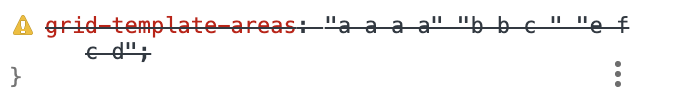
エリアの中の要素が四角形であること
「grid-template-areas」の値に指定する各エリアも四角形(正方形や長方形)である必要があります。
とびとびにしたり、三角形にするとCSSが読み込まれなくなります。
例えば、以下のように「c」が三角形になっている場合は、CSSが読み込まれません。
  grid-template-areas:
  "a a a a";
  "b b c c";
  "e f c d";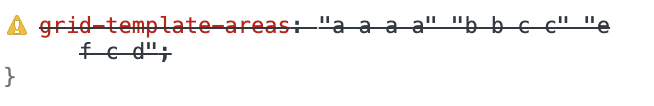
末尾に「;」が必要。(末尾の1つのみ)
「grid-template-areas」でエリアを指定したときは、末尾にのみ「;」が必要です。「;」がなかったり、つける場所がおかしいとCSSが読み込まれません。
▼OKな例
  grid-template-areas:
  "a a a a"
  "b b c d"
  "e f c d";
▼NGな例
  grid-template-areas:
  "a a a a";
  "b b c d";
  "e f c d";
同じエリアに指定すると要素が重なる
「grid-template-areas」で作成したエリアを「grid-area」で各要素に指定するときに、同じグリッド名を指定すると要素同士が重なりあいます。
後に記述している要素が上側に乗り、先に記述している要素は見えなくなります。
既存の行列数よりも多く指定すると行列数が増える
「grid-template-areas」でエリアを指定するときに、「grid-template-columns」や「grid-template-rows」で指定した行列数よりもはみ出して指定すると、はみ出た分の行列が追加されます。
.grid-wrapper{
  display: grid;
  grid-template-columns: repeat(4, 100px);
  grid-template-rows: repeat(4, 100px);
  gap: 20px;

  grid-template-areas:
  "a a a a x y"
  "b b c d x y"
  "b b c d x y"
  "b b c d x y"
  "b b c d x y"
  "e f c d x z";
}
名無しのグリッドエリア名「.(ドット)」は指定できない
「grid-template-areas」を指定するときに、名前を付けずに「.(ドット)」を使って記述することができます。
  display: grid;
  grid-template-columns: repeat(4, 100px);
  grid-template-rows: repeat(4, 100px);

  grid-template-areas:
  "a a a a"
  ". . . ."
  "e f . d";
ですが、この「.(ドット)」を「grid-area」で指定することはできません。
以下のようにするとCSSが読み込まれなくなります。
grid-area: .
grid-template-areasの実例
デフォルトのグリッド
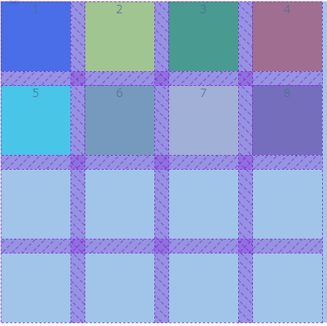
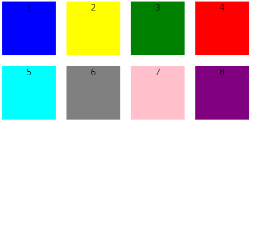
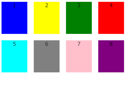
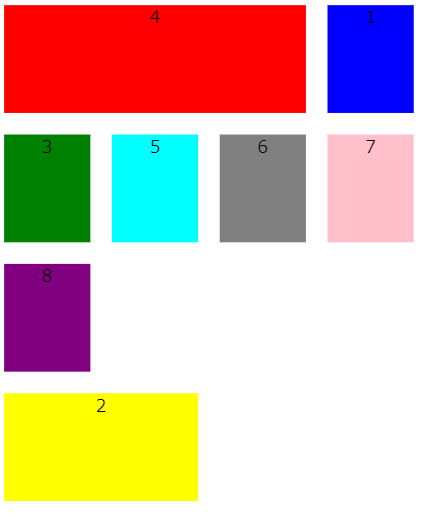
例えば以下のように4 x 4のグリッドの中に8個のdivタグが入った要素があるとします。
4 x 4であることは開発ツールで確認するとよくわかります。
コードは以下のようになっています。(以降でもこの4 x 4のグリッドを実例のデフォルトとして使用しています。)
  <div class="grid-wrapper">
    <div class="box--blue">1</div>
    <div class="box--yellow">2</div>
    <div class="box--green">3</div>
    <div class="box--red">4</div>
    <div class="box--cyan">5</div>
    <div class="box--gray">6</div>
    <div class="box--pink">7</div>
    <div class="box--purple">8</div>
  </div>
.grid-wrapper{
display: grid;
grid-template-columns: repeat(4, 100px);
grid-template-rows: repeat(4, 100px);
gap: 20px;
text-align: center;
}
.box--blue{
background-color: blue;
}
.box--yellow{
background-color: yellow;
}
.box--green{
background-color: green;
}
.box--red{
background-color: red;
}
.box--cyan{
background-color: cyan;
}
.box--gray{
background-color: gray;
}
.box--pink{
background-color: pink;
}
.box--purple{
background-color: purple;
}このグリッドに対して、以下のようにa, b, c, d, e, fという6つの名前をつけたとします。
.grid-wrapper{
  display: grid;
  grid-template-columns: repeat(4, 100px);
  grid-template-rows: repeat(4, 100px);
  gap: 20px;
  text-align: center;

  grid-template-areas:
  "a a a a"
  "b b c d"
  "e f c d";
}
grid-areaを指定していない場合はデフォルトのままです。
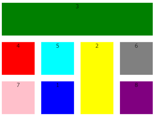
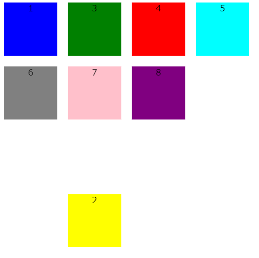
緑色のボックスにgrid-area: aを指定する
ここで、No.3の緑色のボックスに「grid-area: a」を指定します。
.grid-wrapper{
  display: grid;
  grid-template-columns: repeat(4, 100px);
  grid-template-rows: repeat(4, 100px);
  gap: 20px;
  text-align: center;

  grid-template-areas:
  "a a a a"
  "b b c d"
  "e f c d";
}

.box--green{
  background-color: green;
  grid-area: a;
}
ブラウザの表示は以下のようになります。
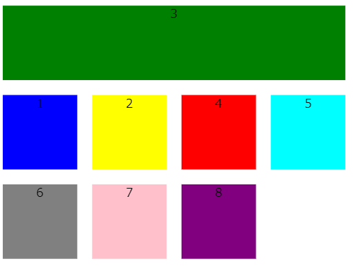
grid-template-areasで指定している「a」の部分に指定した要素が表示されていることがわかります。
  grid-template-areas:
  "a a a a"
  "b b c d"
  "e f c d";
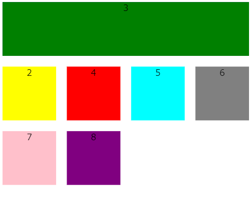
黄色のボックスにgrid-area: cを指定する
続いて、No.2の緑色のボックスに「grid-area: c」を指定します。
.grid-wrapper{
  display: grid;
  grid-template-columns: repeat(4, 100px);
  grid-template-rows: repeat(4, 100px);
  gap: 20px;
  text-align: center;

  grid-template-areas:
  "a a a a"
  "b b c d"
  "e f c d";
}

.box--green{
  background-color: green;
  grid-area: a;
}

.box--yellow{
  background-color: yellow;
    grid-area: c;
}
ブラウザの表示は以下のようになります。
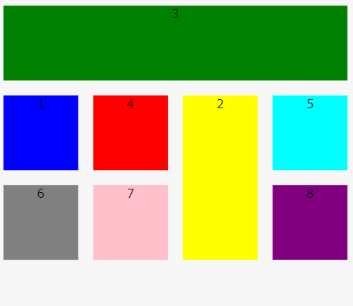
grid-template-areasで指定している「c」の部分に指定した要素が表示されていることがわかります。
  grid-template-areas:
  "a a a a"
  "b b c d"
  "e f c d";
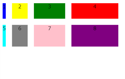
青色のボックスにgrid-area: fを指定する
続いて、No.1の青色のボックスに「grid-area: f」を指定します。
.grid-wrapper{
  display: grid;
  grid-template-columns: repeat(4, 100px);
  grid-template-rows: repeat(4, 100px);
  gap: 20px;
  text-align: center;

  grid-template-areas:
  "a a a a"
  "b b c d"
  "e f c d";
}

.box--green{
  background-color: green;
  grid-area: a;
}

.box--yellow{
  background-color: yellow;
    grid-area: c;
}

.box--blue{
  background-color: blue;
  grid-area: f;
}
ブラウザの表示は以下のようになります。
grid-template-areasで指定している「f」の部分に指定した要素が表示されていることがわかります。
  grid-template-areas:
  "a a a a"
  "b b c d"
  "e f c d";
要素の重なりあい
「grid-template-areas」で作成したエリアを「grid-area」で各要素に指定するときに、同じグリッド名を指定すると要素同士が重なりあいます。
後に記述している要素が上側に乗り、先に記述している要素は見えなくなります。
例えば、以下のように、1つ目の青いボックスと、3つ目の緑色のボックスの両方で「grid-area: a」を指定すると、緑色のボックスが青いボックスに覆いかぶさります。
.grid-wrapper{
  display: grid;
  grid-template-columns: repeat(4, 100px);
  grid-template-rows: repeat(4, 100px);
  gap: 20px;
  text-align: center;

  grid-template-areas:
  "a a a a"
  "b b c d"
  "e f c d";
}

.box--blue{
  background-color: blue;
  grid-area: a;
}

.box--green{
  background-color: green;
    grid-area: a;
}
ブラウザの表示は以下のようになります。
青いボックスが見えなくなっていることがわかります。
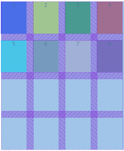
既定のグリッド数をはみ出した場合
4 x 4のグリッドに対して、「grid-template-areas」で 7 x 6の名前をつける場合は以下のようになります。
.grid-wrapper{
  display: grid;
  grid-template-columns: repeat(4, 100px);
  grid-template-rows: repeat(4, 100px);
  gap: 20px;
  text-align: center;

  grid-template-areas:
  "a a a a x y"
  "b b c d x y"
  "b b c d x y"
  "b b c d x y"
  "b b c d x y"
  "e f c d x z";
}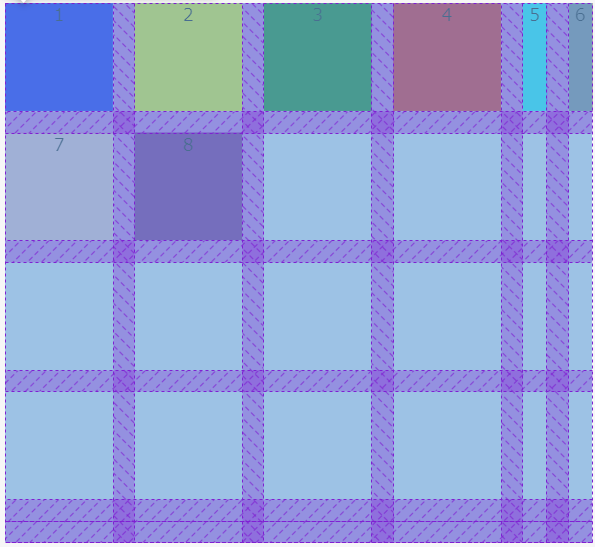
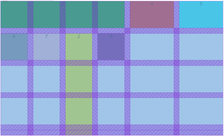
黄色いボックスに「grid-area: f」、緑色のボックスに「grid-area: c」、シアン色のボックスに「grid-area: b」を指定すると以下のようになります。
.grid-wrapper{
  display: grid;
  grid-template-columns: repeat(4, 100px);
  grid-template-rows: repeat(4, 100px);
  gap: 20px;
  text-align: center;

  grid-template-areas:
  "a a a a x y"
  "b b c d x y"
  "b b c d x y"
  "b b c d x y"
  "b b c d x y"
  "e f c d x z";
}

.box--yellow{
  background-color: yellow;
  grid-area: f;
}


.box--green{
  background-color: green;
  grid-area: c;
}

.box--cyan{
  background-color: cyan;
  grid-area: b;
}
それぞれの要素がグリッドエリアの指定した場所に表示されていることがわかります。
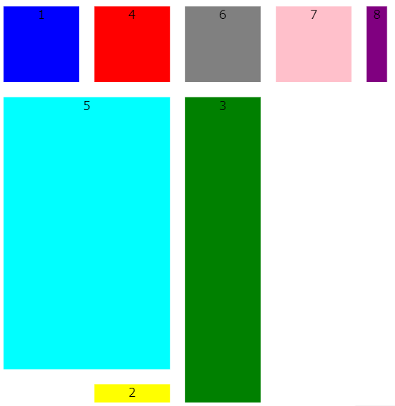
既定のグリッド数よりも少ない場合
既定のグリッド数よりも「grid-template-areas」で指定したグリッドエリアが少なくても読み込むことができます。
例えば、4x4のグリッドでグリッド名を4×2しか指定しなくても読み込問題なく機能します。
この場合grid-areaで場所を指定できるのは名前をつけた場所のみに限られます。
.grid-wrapper{
  display: grid;
  grid-template-columns: repeat(4, 100px);
  grid-template-rows: repeat(4, 100px);
  gap: 20px;
  text-align: center;

  grid-template-areas:
  "a a"
  "b b"
  ". ."
  "e f";
}
黄色いボックスに「grid-area: f」を指定すると次のようになります。
.grid-wrapper{
  display: grid;
  grid-template-columns: repeat(4, 100px);
  grid-template-rows: repeat(4, 100px);
  gap: 20px;
  text-align: center;

  grid-template-areas:
  "a a"
  "b b"
  ". ."
  "e f";
}

.box--yellow{
  background-color: yellow;
  grid-area: f;
}
grid-templateとは何か?
「grid-template」を使うと、「grid-template-areas」「grid-template-columns」「grid-template-row」をまとめて指定することができます。
- grid-template-columns
- grid-template-rows
- grid-template-areas
grid-templateの書き方
grid-templateは「grid-template-areas」で記述した各行の末尾で行の幅を指定し、一番最後の行の後ろに「/(スラッシュ)」を記述して、その下の行で各列の幅を指定します。
列幅の記述が終わったら最後に「;(セミコロン)」で閉じます。
grid-template:
    "a a a ." 1行目の高さ
    "b b . ." 2行目の高さ
    "c d e e" 3行目の高さ
    "f f g g" 4行目の高さ /
1列目の幅 2列目の幅 3列目の幅 4列目の幅;- 各行の末尾で行の幅を指定する。
- グリッドエリアの最後の行の高さを指定したら「/(スラッシュ)」を記述する。
- 一番下の行で各列の幅を指定する。
- 一番最後にひとつだけ「;」をつける。
grid-templateの実例
列の高さと行の高さがそれぞれ一定の場合
例えば、以下のように「grid-template-areas」「grid-template-columns」「grid-template-row」の3つのプロパティを使って作成した、名前付きのグリッドエリアがあるとします。
  grid-template-columns: repeat(4, 80px);
  grid-template-rows: repeat(4, 100px);
  grid-template-areas:
    "a a a ."
    "b b . ."
    "c d e e"
    "f f g g";
これを「grid-template」を使って書き換えると以下のようになります。
  grid-template:
    "a a a ." 100px
    "b b . ." 100px
    "c d e e" 100px
    "f f g g" 100px /
    80px 80px 80px 80px;
grid-template-areasでグリッド名を指定し、その横に各行の高さ(grid-template-rows)を記述しています。
グリッドエリアの最後の行を「/」で区切って、列幅(grid-template-columns)を記述しています。
ブラウザの表示は以下のようになります。
開発ツールで確認すると、指定した行列の高さでグリッドが生成されていることがわかります。
黄色いボックスに「grid-area: f」、赤いボックスに「grid-area: a」を指定すると次のようになります。
.grid-wrapper{
  display: grid;
  gap: 20px;
  text-align: center;

  grid-template:
    "a a a ." 100px
    "b b . ." 100px
    "c d e e" 100px
    "f f g g" 100px /
    80px 80px 80px 80px;
}

.box--yellow{
  background-color: yellow;
  grid-area: f;
}

.box--red{
  background-color: red;
  grid-area: a;
}
それぞれの要素が指定した場所に移動していることがわかります。
列と行の幅をそれぞれ変えた場合
「grid-template」を使えば、各行と各列の幅を簡単に指定することができます。
例えば以下のようにそれぞれ個別に設定してみます。
  grid-template:
    "a a a ." 50px
    "b b . ." 70px
    "c d e e" 100px
    "f f g g" 200px /
    10px 50px 100px 150px;
ブラウザの表示は以下のようになります。
開発ツールで確認すると指定した行列幅が適用されていることがわかります。
参考リンク
グリッドシステム自体の概念や使い方については下記をご参考ください。
【CSS】グリッドシステム(grid system, display: grid;)とは何か?要素の長さや位置の調整方法を実例で解説
グリッドシステム(display: grid)のコンテナ内の要素の上下方向や水平方向の位置を調整する細かい方法については下記をご参考ください。